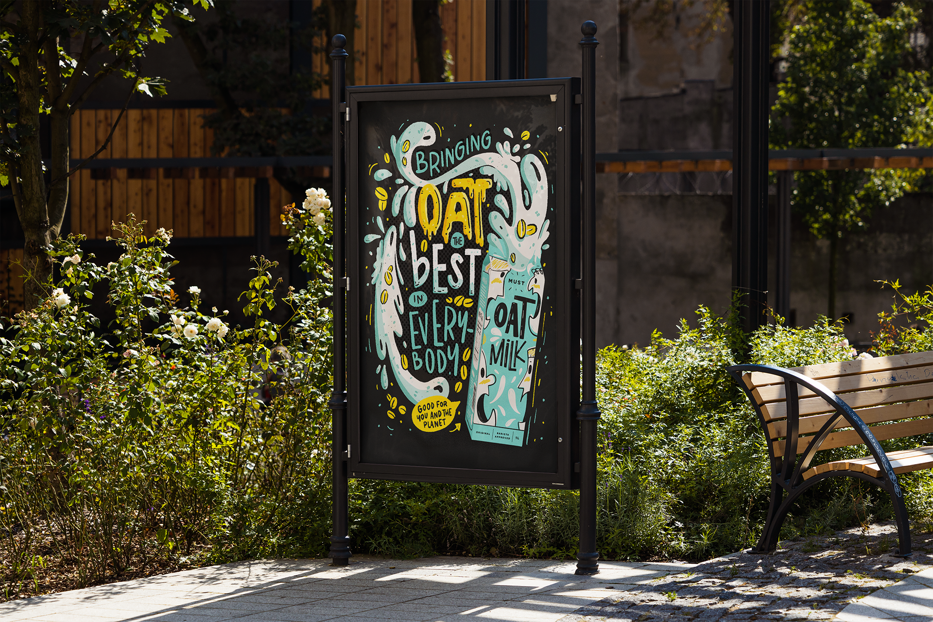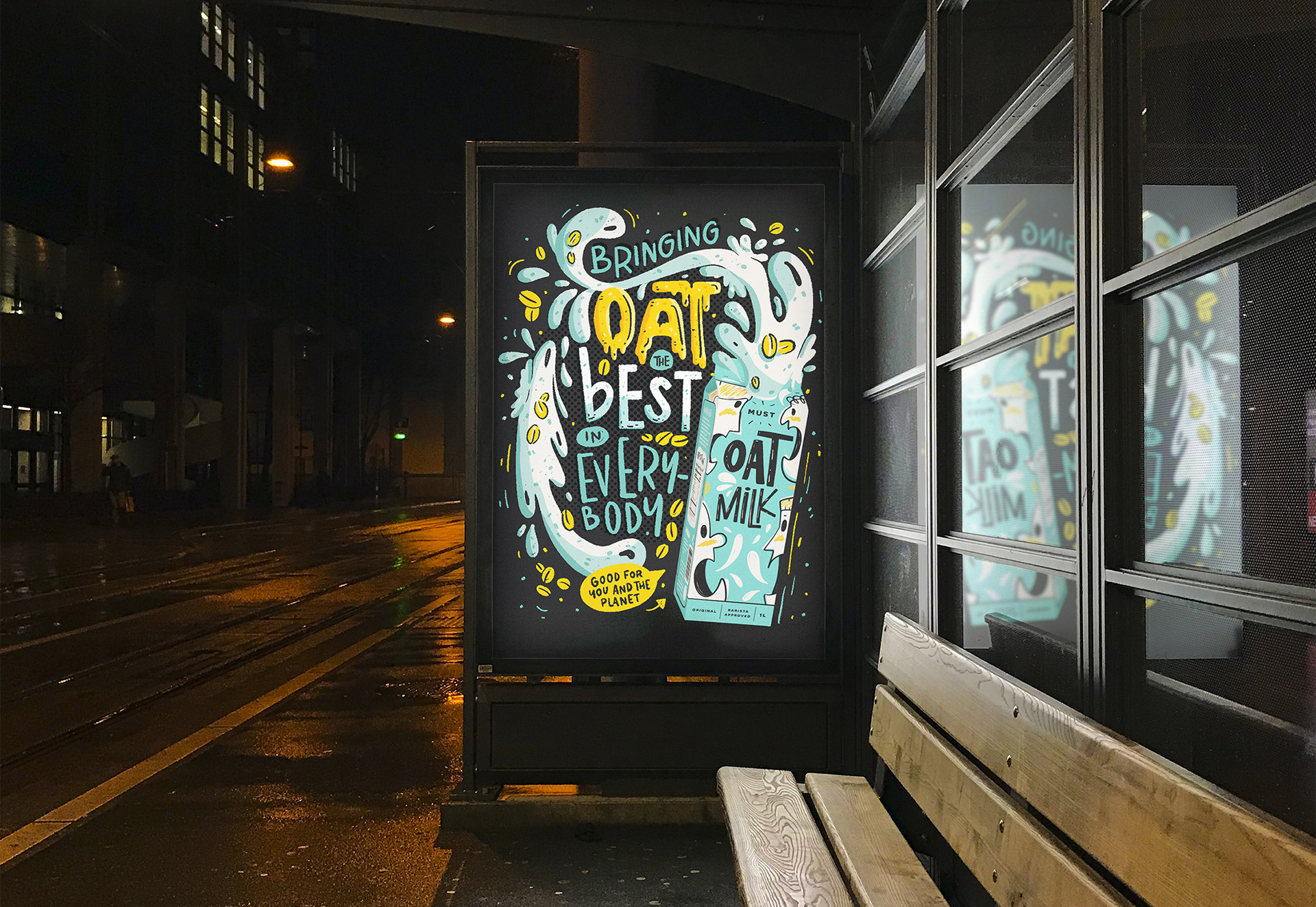
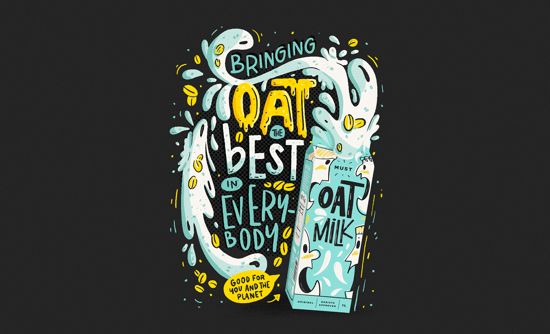
This is a concept project for a fictional plant-based milk brand.
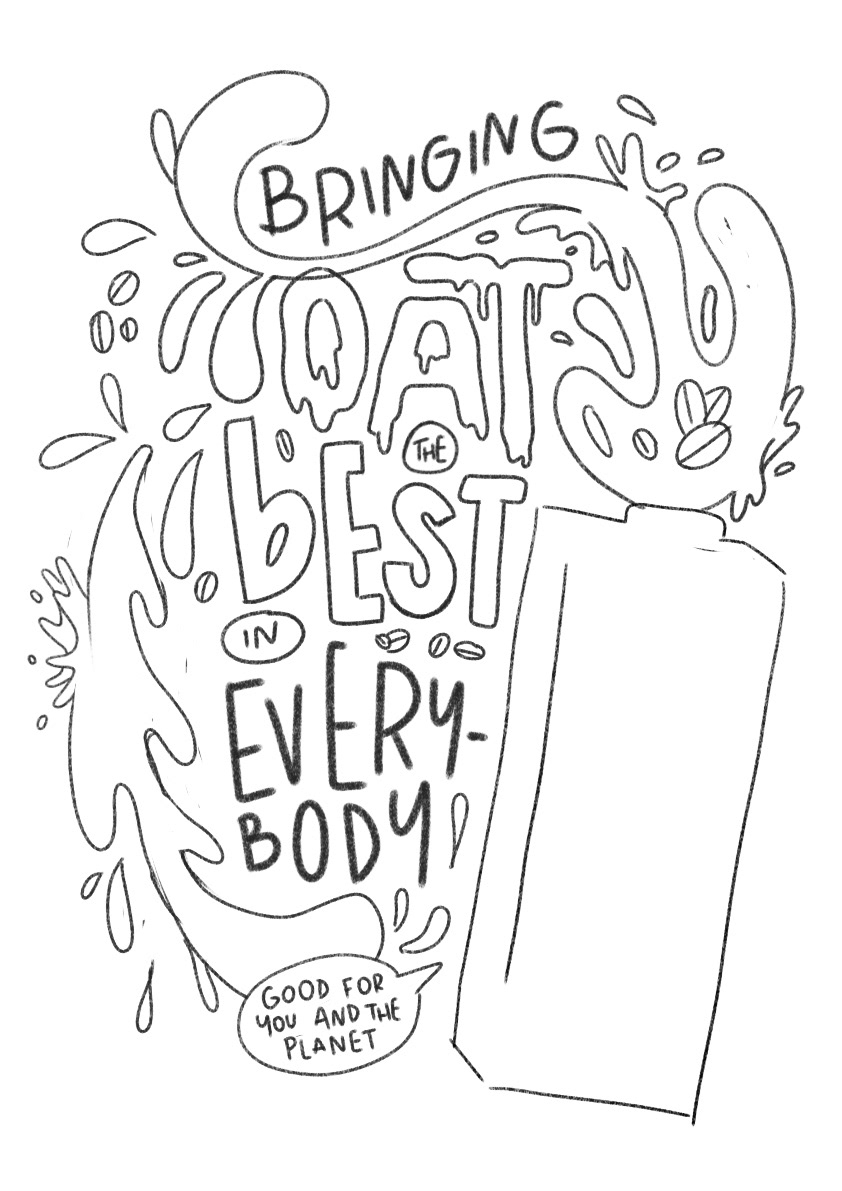
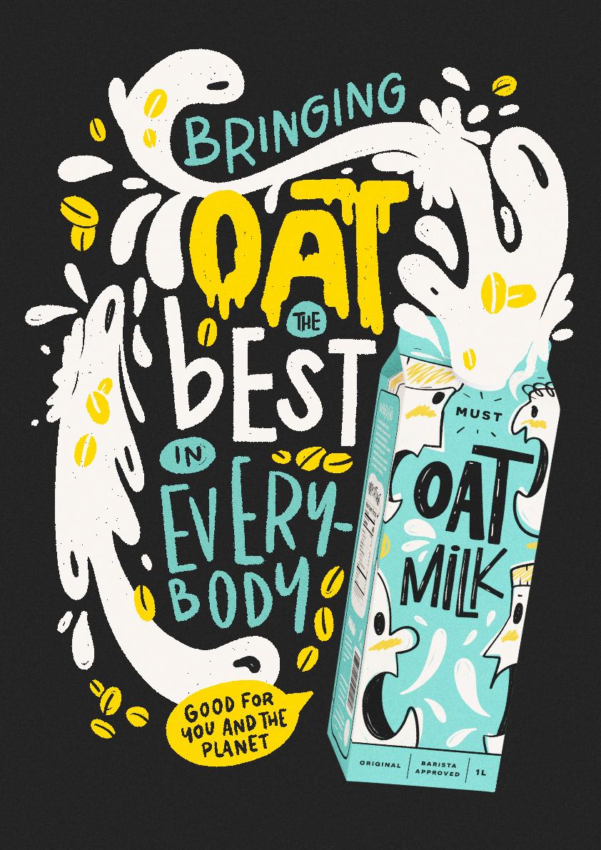
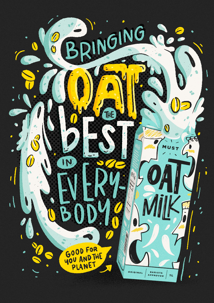
The idea was to create a fun and playful lettering that complements the packaging.
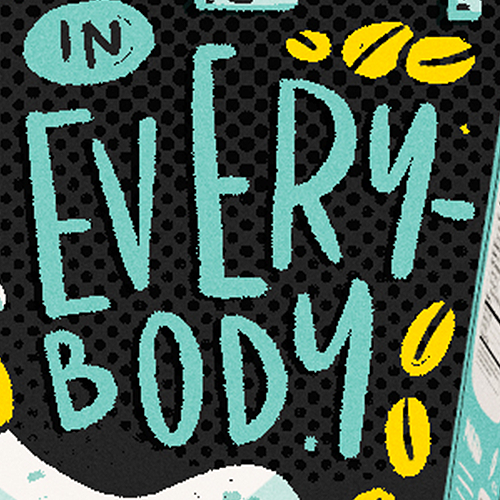
There’s a play on words in this lettering - I used “oat” instead of “out” to make it more fun.
I started out the sketching process already thinking about the placement of the product in a way that would draw attention to it.
Having the colors that represent the brand in mind, I decided to go with the last color combination.
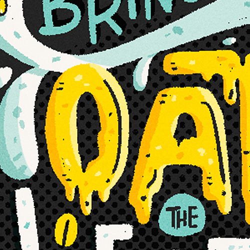
The yellow tone — that's also present in the milk carton — was used to create highlights in the lettering.